Art Gallery
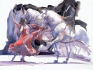
Bailadora y Caballo
 (click to enlarge) |
Title | Artist | Style | Edition |
|---|---|---|---|---|
| Bailadora y Caballo | Fletcher Sibthorp | figurative | 195 | |
| Bailadora y Caballo is Spanish for "Dancer and Stallion" and this picture takes centre stage where it has a whole wall to itself. I liked this picture very much from the moment I first saw it and was drawn to the energy and passion displayed by the dancer. The background with its bold brush strokes adds to the overall vigour of the painting along with the stallion that has a hoof raised indicating the motion of the rider whose attention the dancer is trying to attract. | ||||
|
The elegant and classic Spanish dance pose she adopts is striking and perfectly poised whilst the swirls of her bright red dress emphasis her movements and skill in the performance that is accentuated by the raised arm.
Fletcher Sibthorp graduated with an honours degree from Kingston University and has been commissioned to produce major artworks for such prestigious companies as BP, British Airways and Sony Records. His work has twice appeared on the cover of The Evening Standard and The Royal Shakespeare Company has commissioned him on several occasions. Fletcher's work has also adorned the pages of biographies for both Bertrand Russell and Virginia Woolf and appeared on numerous book covers and record albums. Since graduating, he's built up an impressive record of successes winning six competitions including the Association of Illustrators title on no less than three occasions and six separate Awards of Excellence. Most of Sibthorp's exhibitions are now held overseas in countries such as Japan and Hong Kong where many of his major works achieve prices of ?5,000 and above. |
||||
Sensualit?
 (click to enlarge) |
Title | Artist | Style | Edition |
|---|---|---|---|---|
| Sensualit? | Charles Willmott | figurative | 350 | |
|
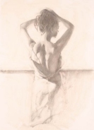
The mood of this image captures perfectly the evocative sensuality of the female form. The lady in the picture is facing away from us to expose her sexy bare back revealed by a partly unzipped gown. The seductiveness of the woman in question is further emphasised by the way she raises her long hair to bare the erogenous zone of her neck whilst the symmetry of her arms frames the focal area around the nape.
I liked this painting as the angle was an unusual one (the face cannot be seen) albeit romantic and the lady has a definite air of class around her. One could say that the unusual angle lends more of a voyeuristic approach to how the picture is viewed since the woman has her back towards us and is facing away from the audience with no indication that she knows anyone else is present. | ||||
|
However, it could equally be the intention that the woman is in a deliberate state of undress and simply getting ready for her lucky partner! Although it appears the lady is comfortable, relaxed and confident with herself, there is an element of intrigue given that her face and eyes are hidden making it difficult to determine what her intention is.
Regardless though, and despite the lack of colour, I find this is a sexy, sensual and steamy image that always invites comments from visitors. Charles Willmott is one of the country's leading contemporary figurative realists and has worked with both the Royal Shakespeare Theatre and the Royal Ballet. In particular, he has worked extensively with principal dancers including Miyako Yoshida and Darcey Bussell. Attention to detail is a hallmark of Charles' work and graphite and charcoal studies are undertaken prior to embarking on the finished work in oil. Much sought after by a diverse audience including major corporate clients, his work has been exhibited at a number of prestigious galleries throughout Europe and Japan. |
||||
Morning Mist
(click to enlarge) |
Title | Artist | Style | Edition |
|---|---|---|---|---|
| Morning Mist | John Waterhouse | landscape | 500 | |
|
I'm not usually partial to landscapes and wasn't too sure about this when I first saw it. However, the panoramic and dreamy vista of a traditional autumnal morning won me over and the picture was just right for hanging in a well-lit room that captures the first rays of the sun.
I particularly like the epic scale of this lithograph with the foreground horse giving perspective to the trees in the background. It's not until you see the horse that you can really appreciate the scale, breadth and sheer openness of the image with its beguiling mist further adding mystery to the shadowy silhouettes. Furthermore, given the size of the trees, this looks like is a mature and well established lea, a notion enhanced by the rolling hills visible at the top left hand side of the picture through the haze. John Waterhouse grew up in a rural Staffordshire village surrounded by beautiful countryside. He was interested in art from an early age and encouraged and inspired by his parents, especially his mother. Although John has been painting as far back as 1983 when he left school at sixteen, it's only as recently as 2000 that he has pursued this as a full time profession after seeing the quality and value of his work rise through doing various commissions for art collectors and galleries. Although his style is mainly landscape, John also enjoys the challenge of painting people. |
||||
Solar
 (click to enlarge) |
Title | Artist | Style | Edition |
|---|---|---|---|---|
| Solar | Claire O'Hea | abstract | n/a | |
|
I wandered into a gallery one fine spring day with the aim of buying an abstract. I had an idea of what I wanted: something quite bold and striking with emphasis on clean, minimalist lines and only the merest hint of colour that would look good in a long empty hallway.
Funny then that I wandered out a few hours later with a wonderful print of Solar that was so not what I was originally after and therein lies the beauty of how a piece of art can beguile, captivate and delight in equal measures. | ||||
|
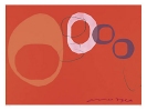
This is a vivid and interesting piece with clever use of colour and geometry that complement one another to create a very tribal theme. Looking at this reminded me lots of Stonehenge as like the picture, Stonehenge too is essentially a collection of carefully arranged but geometrically similar objects. Very often, less can mean more and it's certainly the case here with a nice demonstration of how just a few simple and well chosen shapes can provide impact and vitality to a picture. Claire comes from a fine art background and her designs are influenced by natural and nomadic themes. She's well know for creating striking yet contemporary wall panels, cushions and lampshades using screen printed materials such as silk or paper along with bold and delicate graphic motifs that are torn or cut out to create a variety of abstract designs. Clair's design concept is based upon "the personalisation of a manufactured product that will encourage and invite different feelings of response according to the individual's design choice, combination and placement". |
||||
'Untitled' 1960
 (click to enlarge) |
Title | Artist | Style | Edition |
|---|---|---|---|---|
| 'Untitled' 1960 | Mark Rothko | figurative | n/a | |
|
I still hadn't managed to get quite what I wanted on that fine spring day when I wandered into a gallery on a quest to buy an abstract and with the hallway still empty and folorn, I decided to have a snoop around some more places to see what else might be available. Like before, I had no idea of what I might find but that's part of the enjoyment of going to look at pictures!
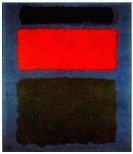
The result was this striking print by the prolific Mark Rothko. Although I was looking for a piece with only the merest hint of colour, this vivid blend of red, black and blue still had a very simplistic yet effective approach to its design. The series of vertically aligned rectangular shapes that would become Rothko's signature style convey depth and structure in a way that envelops the viewer completely. Although at first glance, the image can appear perhaps too simplistic, a closer inspection reveals a level of detail in the saturation and hue that adds complexity to the painting. | ||||
| Mark Rothko was born in Russia in 1903 but moved to the US when he was 10 years old. His early paintings were varied and included many styles such as landscape and portraits. It wasn't until the late 1940's that he concentrated more on abstract and began experimenting with various washes of colours. It was during this period also that Mark would often refer to his images by numbers or colours to distinguish between them. His eventual demise came in 1970 when, suffering from illness and depression, he committed suicide. | ||||
Distant Call
 (click to enlarge) |
Title | Artist | Style | Edition |
|---|---|---|---|---|
| Distant Call | Patrick Ciranna | abstract | n/a | |
|
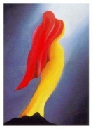
This is a stylish and contemporary print that effortlessly uses sweeping lines and both dark and light contrasts to produce an image of a slender yet grandiose figure. The angle of the light falling down onto the woman is emphasised by the beauty of what looks like a mass of red hair (but it could be a shawl) that tapers off to a point at almost ground level at the same angle.
The figure has a certain heavenly and ethereal quality about her that is more pronounced when you focus on the pinnacle that she's standing upon. Note the way in which the ground is painted at the opposite side of the light rays in keeping with the symmetry of the picture. | ||||
|
What I like most about this picture is how it can convey such an impressive image without having to resort to a fine level of detail or a multitude of textures and shapes. The curve of the hourglass hips are higher than usual and go largely unnoticed at first glance due to the way in which they compliment the sweep of red in the picture.
Patrick Ciranna was born in Paris in 1950 and has travelled extensively for his art. Currently based in St Tropez, he produces work for his gallery there drawing upon his love of music for inspiration. |
||||